
Jacada Travel
Building a Design System for a Luxury Travel Site
Industry
Luxury Travel
Timeline
3 weeks (April 2026)
Scope
Design system
My Role
UX/UI Designer
Foundations
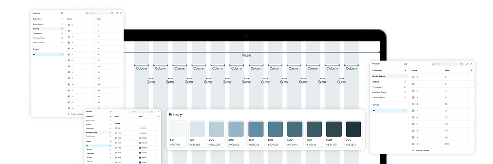
Before designing any component, I set up colors, typography, spacing, radius, shadows, and grid as Figma variables. This meant every component pulled from the same source instead of using random values.
01 - Typography
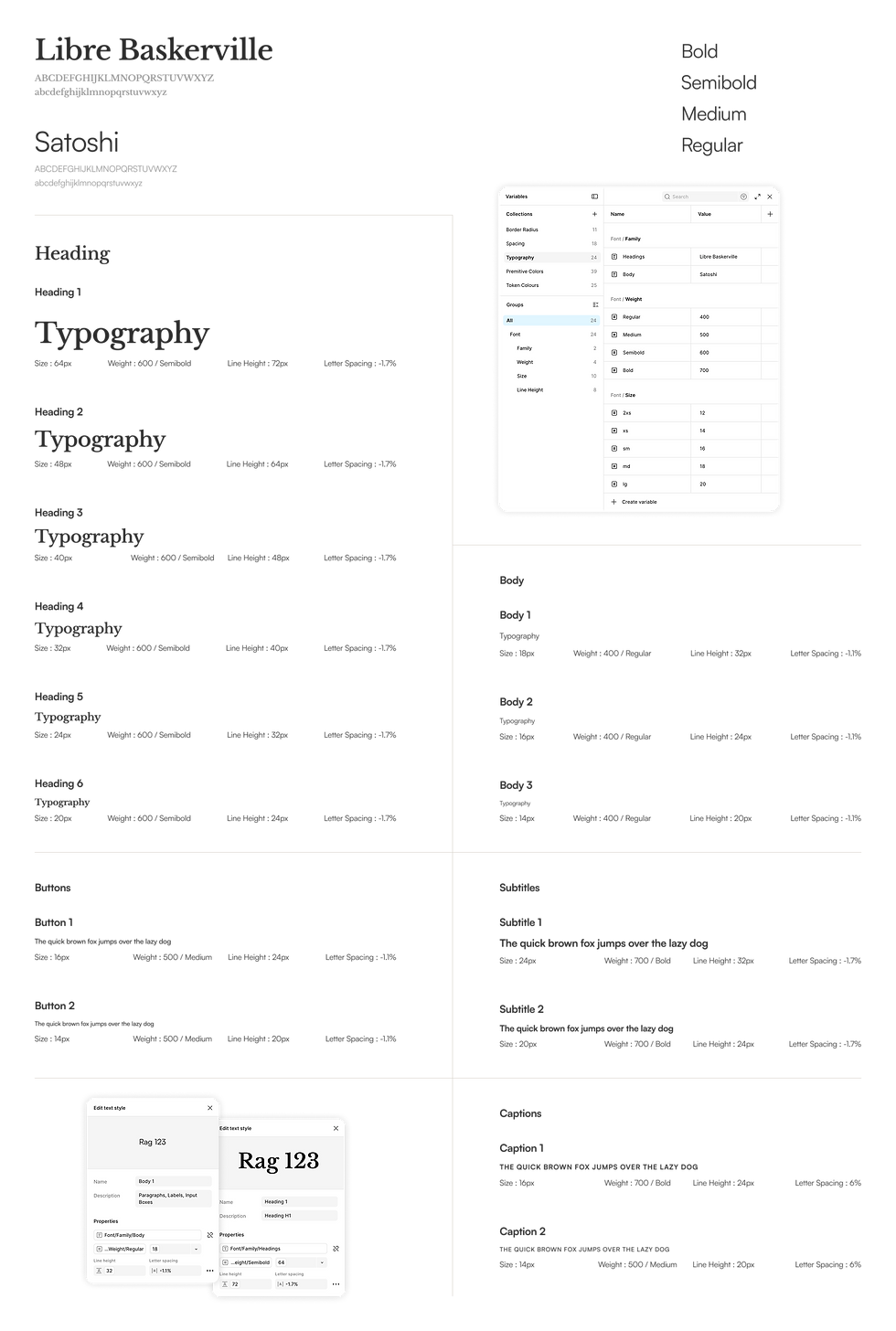
Headings use a serif font. Jacada is a luxury travel brand, so I wanted the type to feel more editorial than corporate, closer to a travel magazine than a booking app. Body text and buttons use a plain sans serif so the actual content stays easy to read. Each text style has a set size, weight, line height, and letter spacing.
02 - Spacing
I used an 18 step scale from 0px to 104px for all margins, padding, and gaps, built in multiples of 4 and 8 to stay consistent with how pixels are usually handled in design and development.

03 - Border Radius
Radius runs from 0px to a fully rounded 999px across 11 steps, following the same kind of scalable step system as spacing, so smaller components use smaller radius values and larger ones scale up, with 999px reserved for fully circular or pill shaped elements.

04 - Colors
Jacada's original branding uses purple. I moved to a deep, rich blue instead for a more premium feel, and kept a warm gold as a secondary tone with sage green as an accent, giving the palette an earthy, luxury look. I built the palette in two layers: primitive colors first, ten shades each from light to dark, then a usage layer on top that assigns specific shades to backgrounds, buttons, and hover states.

05 - GRID
I built three grid layouts for different screen sizes: 12 columns for desktop, 8 for tablet, and 4 for mobile. This is a standard responsive pattern, so layouts adjust predictably as the screen gets smaller instead of breaking or needing custom fixes for each size.

06 - Shadows
I set up four shadow levels: none, small, medium, and large. These control how much depth a card, modal, or dropdown appears to have, with larger shadows used for elements that need to stand out above the rest of the page, like modals.

06 - Buttons
I built buttons in four color variants, dark blue, cream, sage green, and grey, each with default, hover, pressed, disabled, and selected states, plus a version with a dropdown icon. Having every state defined upfront meant I wasn't guessing what a hover or disabled button should look like when I got to actual pages, everything just pulled from the same set.
