The Aesthetica
Redesigning Trust for a Premium Cosmetic Clinic

Industry
Healthcare / Aesthetics
Timeline
Oct 2024- Dec 2025
Scope
Rebrand and Website Redesign
My Role
UX Research, IA, Visual Design, and Website Redesign
Collaborator - Nikita
UX Research, Brand Identity, and Visual Design


THE CHALLENGE
How do we give a first-time cosmetic surgery patient enough trust, clarity, and confidence to reach out from their phone, without feeling committed?
Competitor Audit
The client pointed us to a few competitor sites which he admired and some were local competitor. Looking at those alongside our own audit, a pattern stood out:
The sites that converted best led with credibility
Spoke in patient language rather than clinical labels
None of the local competitors had a responsive mobile experience
02 — Define
We audited the old site like a patient, not a designer.


01 — THE PROBLEM
The site was getting traffic. Patients were not getting in touch.
This was not a design problem. It was a trust problem.
Aesthetica is a premium cosmetic and plastic surgery clinic in Gujarat, India. A patient visiting for the first time had no way to tell if this clinic was right for them. Doctors were invisible. Navigation made no sense from a patient's point of view. On mobile, the experience fell apart.

The Aesthetica Old Website
04 — DESIGN
Four decisions. Each one made for the patient.
01. Make trust visible before anything else
No doctors on the homepage. Ratings present but not prominent. No pricing anywhere.

Doctor profiles moved to homepage. Ratings and reviews were made visually prominent. Transparent pricing table added for all services.

THE IMPACT
72% of visitors actively engaged and spent an average of 49 seconds exploring. This indicated a deeper evaluation before enquiry.
02. Help patients find what they need without knowing the right words
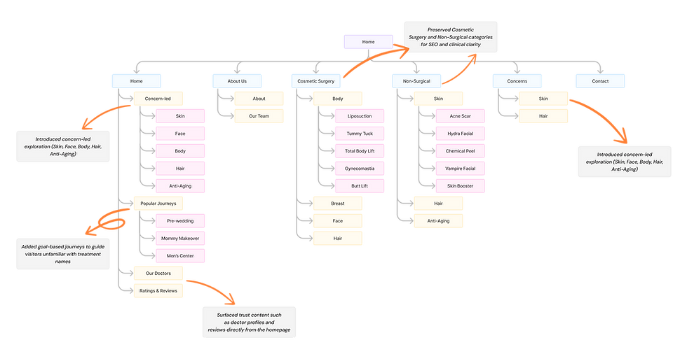
Clinical nav labels. Patients had to know the difference between Cosmetic Surgery and Non-Surgical before they could find anything.

Concern-led tiles added: Skin, Hair, Body, Face. Goal-based packages added: Mom Makeover, Pre-Wedding, and more. The original nav kept for SEO.

THE IMPACT
58,442 engagement events across 40,952 users. Users were exploring deeper instead of leaving.
03. Rebuild service pages around how patients read
Walls of text. Clinical headings. No images, no visual hierarchy.

Each service page rebuilt into scannable sections. Images paired with content, plain language headings, digestible content blocks.

THE IMPACT
Visitors viewed an average of 1.46 pages per session, suggesting patients were moving through service pages rather than dropping off at the homepage.
04. Make it easy to get in touch from a phone
Built mobile-first from wireframes. WhatsApp as primary contact. Persistent CTA in nav on every page.

THE IMPACT
Enquiry volume increased after launch. "We're getting more enquiries and patients are converting." — Aesthetica Client
05 — VISUAL SYSTEM
The brand came first. The website inherited it.
Nikita led the brand identity. My job was translating it into a consistent, scalable UI system.
Burgundy for authority. Gold for warmth. Blush neutrals instead of harsh white. Cormorant Garamond for headings, Jost for body copy. Every component built once, used everywhere — buttons, cards, form fields, nav states. The identity extended into physical collateral too: business cards, rate cards, clinic standees, and a coffee table book for the waiting room.

06 — REFLECTion
Challenges
No direct access to patients
We couldn't interview a single person who would actually use this site. All our insights came secondhand through the client.
SEO constraints shaped the design
The site needed a lot of text and clinical nav labels to rank on Google. We couldn't just remove them. We had to design around them.
Sensitive content, premium feel
Procedure images, surgery photos, and clinical descriptions — the content was rough by nature but the brand had to feel premium. Every image choice and layout decision was about making difficult content feel safe and considered, not shocking.
I ended up in the code
Got WordPress access post-handoff to fix animations the developer built wrong. Not in scope but the site needed to match the design.
03 — IDEATE
Before designing anything, we needed to agree on the structure.
We mapped out a new IA with the client — taking everything that existed and restructuring it around patient concerns and goals rather than internal departments.